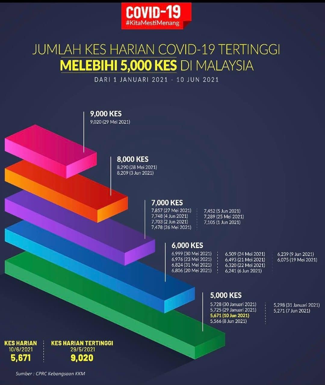
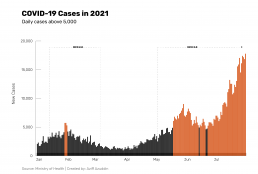
Two months ago, the Ministry of Health began distributing charts of new COVID-19 infection cases over 5,000. It was an interesting chart because the intent seemed clear: to visually quantify and communicate to the public the severity of infection cases. Around this time, the increasing number of cases was attributed to mass testing conducted in Selangor or most case clusters emerging from industrial factories. This is well into the third iteration of the Movement Control Order (MCO 3.0), and the increasing cases were puzzling despite the almost total nationwide lockdown.
However, this chart is not without its problems.

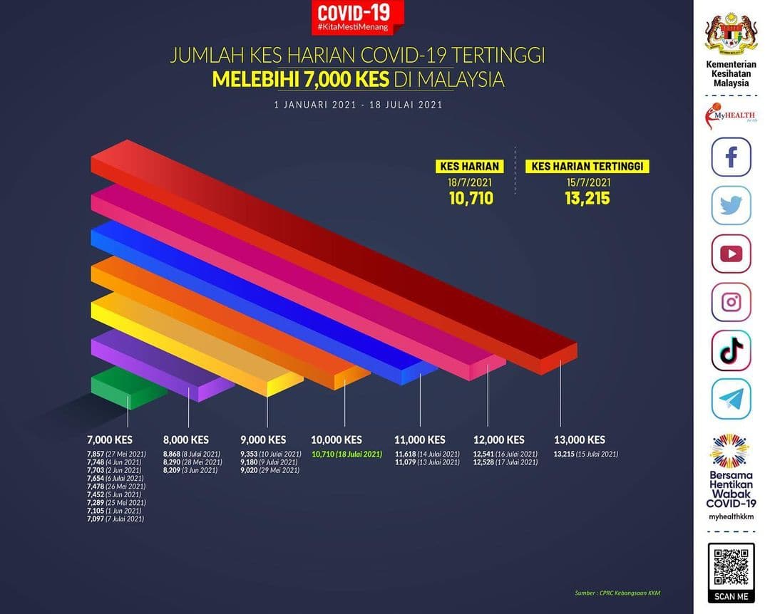

Over the coming months, the Ministry of Health continued to release such charts daily with some adjustments as time went on. At one point, on July 16, they changed the format of the chart so that x-axis on the number of cases visually corresponded to the severity of the situation. Compare this to the original chart above, where above 9,000 cases were depicted with a small length – representing the quantity of cases but not the severity of the situation.
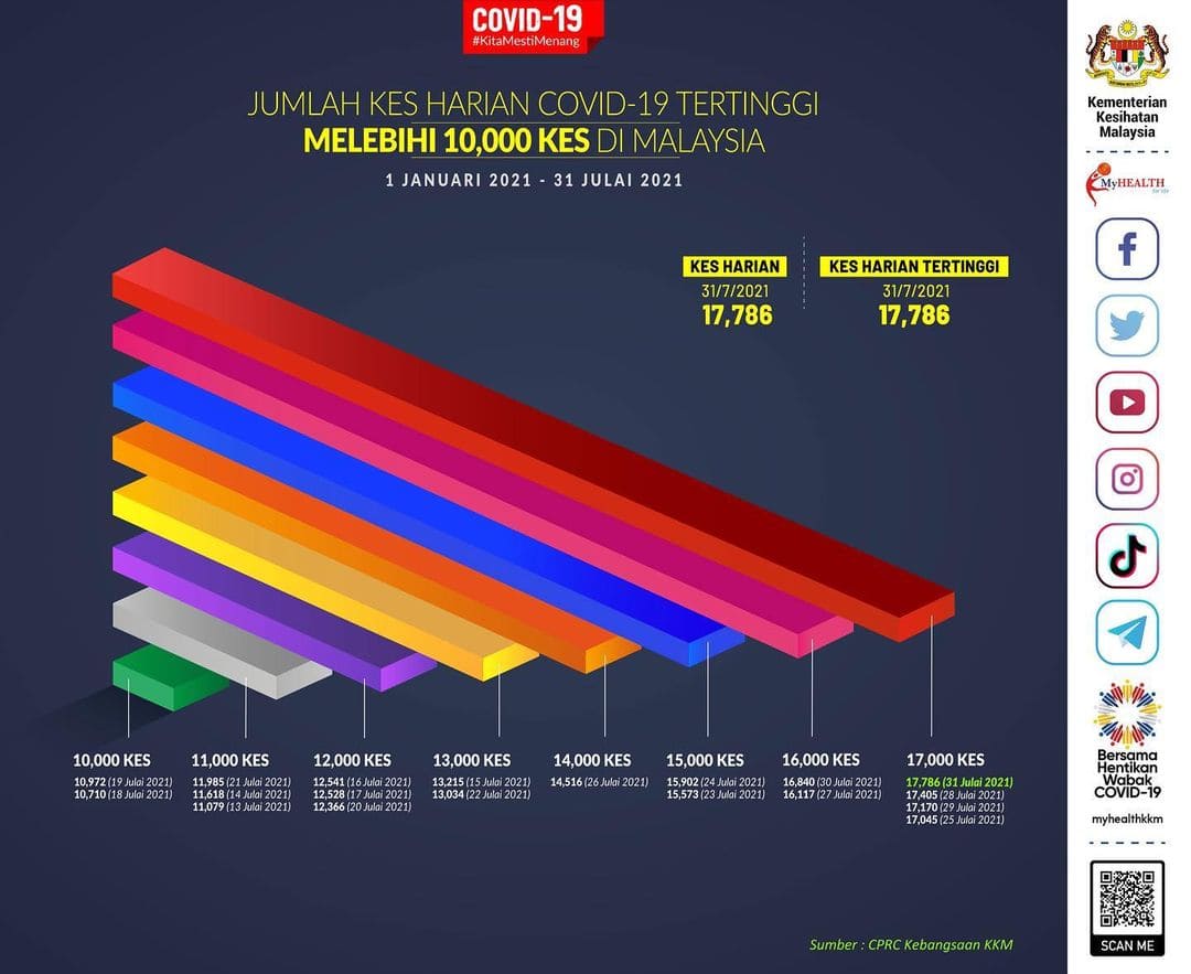
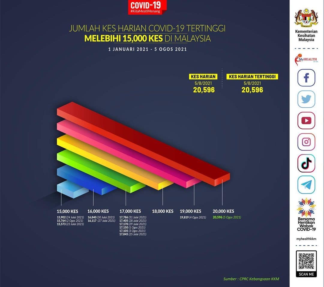
Further changes took place. On July 18, the chart changed to represent cases above 7,000. On July 25, the chart reflected cases above 10,000. More changes took place as the COVID-19 positive cases increased in the coming weeks. On August 5, the threshold was increased to 15,000 cases. No less than a day after that on August 6, the Ministry of Health redesigned the bar charts to be vertical instead of horizontal. There are some changes to the colour, but overall the severe design and data visualisation problems remained.
- Lack of clear purpose. What is the purpose of this series of charts? Superficially, it intends to communicate the number of cases above the threshold of 5,000 (or more) new infections cases. However, what good is it to the public to know such information?
- Lack of context for the data. The charts exist without proper context. What I mean here is that the only context or parameter provided is that the data range is cases that took place between January this year up to the current point. There is no mention of R-value (infectivity rate) or the enforcement of the different Movement Control Orders. These two and other factors are important in contextualising the data. This lack of context is what leads to the earlier point on the chart’s lack of purpose.
- Purpose of dates and their readability. The charts and the different ‘000s thresholds, if examined closer, indicates the date and the number of cases. While this presentation of granularity is good, it also comes with its set of issues. Firstly, is that when viewed through the screen, it becomes difficult to read such small text. Secondly, these dates are devoid of context. Ie. Questions such as: ‘is this number during MCO 3.0’, ‘did it happen after a major holiday’, etc., give further meaning to these dates. When read alone, the data is meaningless.
- Inconsistent data threshold. As discussed earlier, this series of charts changed its threshold twice from 5,000 to 7,000 and 10,000 cases over two months. In less than a week, the threshold was again increased to 15,000. This inconsistency brings to question the primary purpose of the chart. The increasing amount of cases under the 5,000 cases banner likely justified the increase of threshold. However, there is dishonesty in this “changing of goalposts” if the charts’ secondary intention is to show less cases above the threshold.
- No consistency. This is related to the issue of an inconstent data treshold. Over the past three months since the chart series’ debut, it had initially undergone a visual change. Despite the threshold changing over time, the design was maintained up to the most recent iteration. In which, a drastic makeover in terms of colour, format and presentation was done. This lack of consistency is problematic because it points towards the question of both its purpose, as well as a failure in consistent data communication to its intended audience. No consistency in design would lead readers to not have a historical understanding of the charts series, and makes it difficult for them to trace its historical changes,
- Irrelevant information. This series of charts are published daily. The problem with this is that it is also released alongside other public communication materials with the same information, such as daily case numbers. The chart, as it is, already lacks context. Additional information irrelevant to the chart’s purpose will only further confuse readers and clutter the chart design.
- Irregular colour hierarchy. There is no consistent or logical use of the chart’s colours. While the higher cases begin with red, a colour that communicates urgency and danger, the colours that follow do not have thematic consistency. There is a mix of orange, blue, green and more in random order. There is no visual consistency.
- No x or y-axis. Out of all fundamental errors committed by this chart series is the lack of an x or y axis to ground the data. However, upon closer reading, it is likely because there is no coherent categorisation logic, apart from the ‘000 case breaks. The lack of an axis makes it challenging to communicate to the reader what the data categories represent. Another issue that comes with having no axis is that the data category begins at 5,000. While this is the minimum threshold set by the chart, it is also a dishonest practice of setting a starting mark of 5,000 because when taken into context, 5,000 COVID-19 infection cases a day is considered an alarming number.
So how might we fix these series of issues?
Returning to the basics
After taking into consideration the existing issues with the Ministry of Health’s charts, I would propose returning to the fundamentals of data visualisation. For the purposes of illustrating an example with consistency, I am using COVID-19 case data up to 31st of July 2021. The bar chart below is my proposed version.
There are several things I wanted to achieve with this simpler but more straightforward chart.
Currently, the Malaysian public closely follows COVID-19 daily cases. As the numbers steadily increase, so do the public health anxieties surrounding the state of the nation. This is particularly important given how the country is currently undergoing the third iteration of the Movement Control Order (MCO 3.0). In this regard, daily COVID-19 numbers should be contextualised on a linear timeline. This is why it is crucial to indicate that the increase of cases is taking place within the MCO 3.0 period. A clearly communicated chart allows the audience (as well as policymakers) to ask important questions such as: Why are COVID-19 cases increasing despite the nationwide lockdown for over two months?
Data needs to be contextualised to be fairly assessed and analysed. In the case of COVID-19 daily cases, it is then best contextualised within a linear, chronological timeframe.
How do you tell the public that a particular piece of information should be paid attention to? This can be done by drawing attention to it in several ways. In the chart above, cases above 5,000 are in red to make it stand out in the timeline. This is the initial threshold used by the Ministry of Health in their chart series. By highlighting important information, you are telling the audience that this particular data is significant. The importance of the information is also likely to influence the audience’s behaviours. Would a steady increase of over 5,000 cases over time create a panic? Or can it be accompanied by reassurance from the federal government that necessary action is being taken to curb the rise in cases?
The increase in cases may correspond to an increase in mass testing, particularly in Selangor. Or it may be indicative of the higher infectivity of the Delta variant. Whatever the possible reasons, communicating and highlighting this data is vital in allowing the public to gauge public health and safety. This may also help modify their behaviours to encourage SOP compliance or stay-at-home orders.
It is essential for data and labels on a chart to be readable and logical. This is why I opted for a simple bar chart that shows the linear progression of cases and clear labelling of all crucial elements. While not visually innovative, it gets to the core of data storytelling: to communicate data. Sometimes, the best solution is the simplest one.
Looking at the chart, it is unmistakable that the case numbers are increasing over time despite MCO 3.0. What is clear is that the established threshold of 5,000 cases has been exceeded long ago, in mid-May. These are the two key takeaways of the chart, made possible by clearly presenting the data and labelling the respective elements.
Closing remarks
When presented with the opportunity, it can be tempting to want to present data in a visually creative manner. However, a visually attractive chart that is incomprehensible is worse than a boring but easily understood chart. What is most problematic about the Ministry of Health’s latest chart series is the existential nature of the charts. It is difficult to understand its purpose — mainly because of the decision to increase thresholds every time the daily cases hit the ceiling. This inconsistency is perhaps at the core of why the chart is ineffective. As for design and data storytelling principles, the charts lack a fundamental understanding of basic data visualisation. That the chart has recently evolved into an iteration of a different colour and turned from a horizontal to vertical bar chart is indicative of this.
The version of the case-threshold chart I created, while straightforward, is concerned with communicating COVID-19 cases accurately and with context. That means to situate the data within both a time frame and the occurrence of the MCOs. While from a government perspective, the alarming increase in cases may not be good for their public image, it is essential to communicate these data honestly and accurately. These charts, after all, are not for show. They are one of the avenues the Malaysian public makes sense of the pandemic and gauge the public health state of the nation.