It is almost three weeks into the Movement Control Order (MCO), with cases reaching into the thousands daily. Despite the government’s attempt to innoculate the public with the optional AstraZeneca drive, little has changed in the infection cases. The recent Aidilfitri celebrations had also left policy-makers and the public worried about a rise in COVID-19 infections – due to many not adhering to outlined Standard Operating Procedures (SOP).
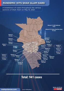
On May 15th 2021, the local news portal MalaysiaNow exemplified this concern with a news report detailing the alarming COVID-19 cases in the Shah Alam township. While the report was good and contextualised the infection cases well – the accompanying graphic, a map detailing the COVID cases and the specific neighbourhoods it occurred in was not communicated well.
As a researcher concerned with communicating data well, there are a few issues with MalaysiaNow’s graphic.
- Using the township’s entire map. The Shah Alam township map, sourced from Wikipedia, shows the whole township under the Shah Alam City Council (MBSA). The issue with using the entire map is that it also includes neighbourhoods that do not have COVID-19 cases. It also reduces the breathing space to design creatively due to having to also consider other parts of the map in view.
- The use of arrows to indicate COVID cases and its corresponding neighbourhoods. Because of the use of the entire township’s map, this leaves the illustrators with little room to edit creatively. While the use of arrows to indicate cases and their corresponding areas is spartan and utilitarian – the information is ultimately difficult to make out. This is because most of the cases are in the township’s centre, and a barrage of arrows makes it difficult for the audience to make out the information cleanly. In other words, the information displayed is messy.
- Some cases and neighbourhoods have arrows, some have boxes, some none. The use of boxes is a consequence of not having enough space to use arrows. As a reader, I am wondering if the information in the boxes is more or less important than those designated an arrow. In the top right are two localities with cases that have neither boxes nor arrows.
For these reasons, it isn’t easy to understand the information the graphic is attempting to communicate. We know as a reader that the graphic wants to communicate two things: 1) COVID cases and 2) localities these cases emerged in. However, the manner the data was designed makes it difficult for users to situate themselves in the map due to its messiness and derive the information easily.
Design principles for maps
Esri, an international company focusing on mapping software, outlines five key design principles when communicating cartographic information. The principles are as follows:
- Visual contrast. A visual contrast allows the audience to distinguish the information displayed on the map. This is done primarily through colour.
- Legibility. Is the information conveyed easily recognised or understood?
- Figure-ground. Separating the focus area of the map from the surroundings. This is to visually signal to the audience where they should be paying attention to.
- Hierarchical organisation. Is the information on the map organised to allow the audience to understand the information and how they are categorised differently? This is incredibly important in communicating to users to observe the patterns that you want them to see.
- Balance. How is the entire map or graphic organised in a way that visually balances all elements on it equally? This has to do with how the map’s legends, element alignments, etc., are arranged.
MalaysiaNow’s graphic, while commendable, does not adhere to these design principles, which makes their Shah Alam graphic challenging to decipher.
Visualising COVID cases in Shah Alam
I must disclose here that I am an amateur cartographer. I have a deep interest in maps and some skill in Geographic Information Systems (GIS), but I am by no means a professional map maker. However, my approach to cartography is informed by my background as a researcher and one concerned with data communication.
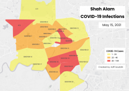
The following graphic is my version of how I would design the Shah Alam COVID-19 infection cases map.
Design principles aside, there were a few key things that I wanted to communicate with my COVID hotspot map.
It is reasonable to believe that those who would be interested in this COVID infections map are those who stay in Shah Alam. This is why I superimposed the COVID cases data over an existing map. By using a geographical reference, audiences can situate themselves on the map. This top view is also likely familiar to Malaysian users, given the ubiquity of online maps in navigation and information-seeking. The latest numbers also show that most Malaysians use Google Maps, familiarising users with the basic visual concepts of cartography since its local introduction in 2009.
By indicating the Sections (or neighbourhoods) in their respective areas, users living in those localities will be drawn to information relevant to them. This clarifying of locality information is important because users may not be able to identify their neighbourhoods on the map due to the colour scheme of the COVID cases.
Now that users have located themselves on the map, they expect to know the severity of the cases in their areas. This is where the use of colour schemes as a way to communicate this information is important. Firstly, I needed a (visual) reference point to communicate severity. For this, I used the Ministry of Health’s (MoH) case severity’s colour scale as seen on their official COVID-19 graphics. For MoH, green is to indicate no cases. Yellow is to indicate 1-20 cases. Orange is for 21-40 cases. Finally, red for more than 41 reported cases.
This colour scale has been widely used globally since the beginning of the pandemic last year as a way for governments to communicate risk levels and the appropriate responses to them. It also leverages general colour theory where warm colours (red, orange, yellow) attract attention and indicate danger.
The legend on the right-hand side also follows MoH’s convention to group case numbers. This is where we need to ask ourselves if it’s important for the public to know exact case numbers (as per MalaysiaNow’s graphic) or if it’s more valuable to give users a top-down idea of how risk looks like in their area. Both approaches have different outcomes. The former is helpful for policy where exact numbers in decision-making are important, while the latter is useful for public communications and directing public perception and behaviours.
In other words, the public does not need to know how many exact COVID cases are in their areas; they only need to know that these are the risk levels (using colour) associated with those numbers and change their behaviours accordingly.
The original MalaysiaNow map uses the entire Shah Alam township, which visualises cases with no cases. The question here is whether or not it is relevant to the audience to know this information, particularly areas with no cases. When an individual (presumably a Shah Alam resident) examines the map, they would want to know if their area is affected. It is also reasonable to assume that if your area isn’t on the map, it is unlikely that there were reported cases.
Apart from an economy of space (fewer items to visualise also means more space to display relevant information), it also allows us to focus on the key data we want to communicate. Applying the principle of relevance, I removed neighbourhoods without COVID cases, which allows the map to have a tighter focus on central Shah Alam and areas that do have reported cases. This zoomed perspective will enable users to identify their neighbourhoods and situate themselves on the map easily.
To touch the earlier point on communicating severity, condensing case numbers into (visual and numerical) groups also removes irrelevant information (such as exact numbers) that could potentially distract the audience. It also allows the audience to interpret the information without too much difficulty, which is the goal of a useful COVID case map.
A comparison of COVID case maps
Now that we have gone through the issues with MalaysiaNow’s graphic, the cartographic design principles outlined by Esri, and how I would redesign the map, let us compare the two.
Which of the two is preferred in communicating COVID cases?
Conclusion
We often take maps for granted. Decades ago, maps were helpful for navigation, but its public use in the modern-day has expanded beyond finding the right roads for holidays. Thanks to digitalisation, maps nowadays allow us to navigate and situate ourselves within our surroundings. Platforms like Google Maps allows us to find new places to explore and business to frequent. Apps like Waze not only provides navigation but also informs us of potential obstacles along the way.
While this case study may seem like a simple breakdown of how to design clearer maps, particularly for COVID cases in a locality, I also hope you would be able to walk away thinking about how to design maps that communicate visual information more clearly. These are all relevant in digital cartography as we increasingly rely on maps to make sense of the world around us.
Recommended Reading
- To Navigate Risk In a Pandemic, You Need a Color-Coded Chart – Wired
- Students Use GIS-Based Maps, Apps to Study the Effects of the Pandemic – Wesleyan University
- Smart Maps Guide COVID-19 Investigations and Actions, and Monitor Effectiveness – ESRI Blog
- A Shining Moment for GIS: Responding to COVID-19 with Maps – Harvard Kennedy School
- Notable maps visualizing COVID-19 and surrounding impacts – Mapbox